
One of the many things I’ve been working on during the off season is kicking spray charts for the NRL and rugby league in general. I’d been wondering if different players had different kicking profiles and if there was a way to visualise this.
I got the idea from seeing some MLB spray charts on social media.
The idea behind this chart is that it visualises where a player is hitting the ball overall, and allows you to filter down on different variables such as how they fare against certain pitch types. It makes it quite clear what the path and outcome is of every hit.
And like a lot of the Eye Test’s advanced metrics, I’ve taken something that works well in another sport and tried to apply it to rugby league. It made me wonder what a spray chart for general play kickers would look like.
Obviously, the flaw this is that in our great game is not like baseball, where the batter in the same spot for every one of their at bats, which naturally creates a spray pattern when you map their hits. General play kickers in rugby league can be anywhere on the field AND aiming for anywhere on the field.
Add to that most general play kickers are halves and are usually segregated to one side of the field in attack. This can and does limit the direction and distance of these kicks.
Even with these caveats, I wanted to see what the results looked like. However, I couldn’t just map the origin and end location of each kick given the above issues of general play kicks coming from anywhere on the field.
With this in mind, taking the starting location of every kick from the past two seasons, I normalised the origin of every kick attempt to the same coordinate to make sure every kick originated from the same point for my chart.
Then I joined that normalised kick origin to the relative end location of the kick to create a path for the “spray” that you’ll see below. That relative end point is from any kick outcome, either going out (on the full or bounce) or being received by the opposing team. That gives me a line from point A (kick origin) to point B (kick end) for every kick attempt, all originating from the same starting location and creating the “spray” you’ll see below.
The other adaptation I made from most of the MLB charts I’d seen was to also map the path of the kick. Given that the outcome of the vast majority of general field play kicks in rugby league result in an opponent carry, having an outcomes based chart didn’t feel like the best proof of concept. Instead, I thought the angle and path of the kick might provide a better initial insight, and if it worked then I’d look at using kick outcome as another layer.
The end results were probably more interesting than I’d expected. For example, here’s Luke Keary’s overall kick spray chart for 2023.
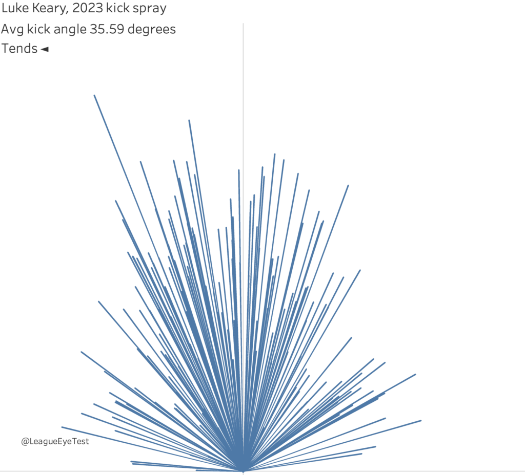
The positive from this chart is that it’s very clear to see where a player is kicking to, which side they prefer and which attempts are traveling the furthest and which were aimed for the sides of the field. Each line shows the path of each kick from it’s normalised origin to its end point relative to that origin. Obviously they aren’t always kicking from the same location, but it does show an overall tendency.
However, I had some questions around the kicks at the bottom of the spray chart, which were shorter and wider that the majority of his attempts. My initial thoughts were that these would be attacking kicks, but from the above chart you couldn’t be sure.
I decided to overlay the origin of the kick on the above chart, splitting them from 0-30 metres out as attacking kicks (orange), and anything further than 30m out as a “distance” kick (blue). You could argue that attacking kicks could also originate between 30-40 metres out, and I wouldn’t necessarily disagree but for this experiment I’ve gone with inside 30 meters as the cut off point.
The difference in the visualisation was immediately noticeable.
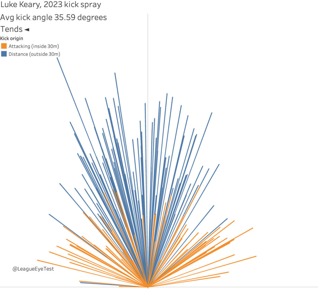
We can now clearly identify why the kicks at the bottom of the chart were at such a wide angle. Unsurprisingly our assumption was true, they were from attacking kicks. Given that Keary had Daniel Tupou and Joseph Sua’ali’i as his targets, you’d be expecting a lot of attacking kicks to be aimed at them. As a disciple of analytics purpose of “the art of being less wrong”, this was a great outcome.
To add some extra layers to the chart, I also included in the average kicking angle for each player. It’s one thing to be able to see the spray chart, but adding in an overall average angle provides an extra point of comparison. It would enable me to see which player had the largest angle from their kicks, and which player had the narrowest, and more importantly why players had different average kicking angles.
It’s one of the reasons I chose Keary as the example for the first chart, because his 35 degrees was the widest average angle in the NRL in 2023. Harry Grant was the only other player above 33 degrees, and he had 75% fewer attempts than Keary, and as a third choice kicker it would make sense for a bigger variance on his kick angles. At the other end of the scale, of all players with at least 100 kick attempts in 2023, Kieran Foran had the narrowest average angle at just 18.97 degrees. Again, not a primary kicker (Tanah Boyd had nearly 600 attempts).
After adding the attacking and distance split, the last bit of information to add was showing which side a player generally favoured. One thing to keep in mind that the average angle of the kick is independent of this side preference and is the average for all kicks.
Going back to Keary’s chart, his chart shows 35.59 degrees with a left side tendency. That indicates that each kick (left or right), is at an average angle of nearly 36 degrees, but overall he kicks more left than right.
These charts can also show the difference between teams having a primary kicker, like the Sharks with Nicho Hynes, or sharing the duties between both halves like the Melbourne Storm do.
To illustrate this, here is Hynes’ kick spray chart for 2023, showing his kick attempts split relatively even across the field from a very high volume (500+ attempts).
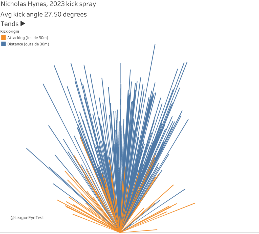
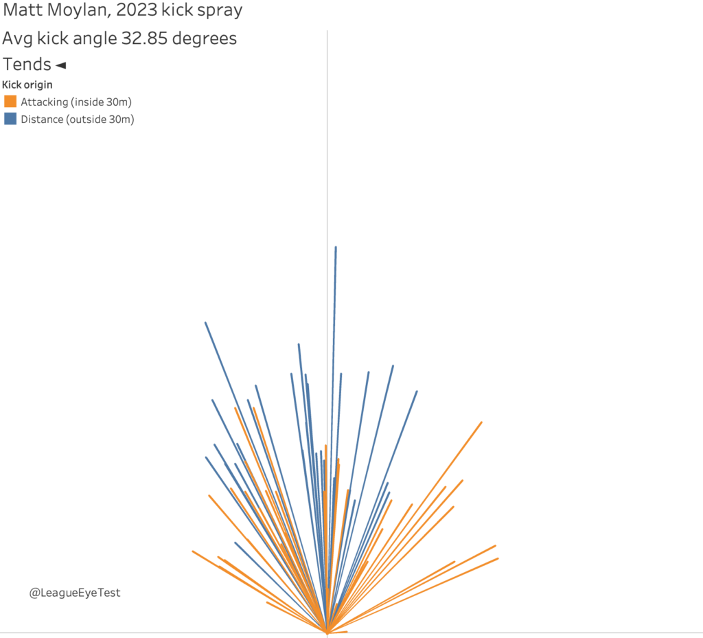
Given how infrequently Matt Moylan was kicking the ball (fewer than 150 attempts) and his weakness kicking long this, Hynes’ chart isn’t surprising.
It also explains part of the reason why the change was made to Brayden Trindall as Hynes’ halves partner.
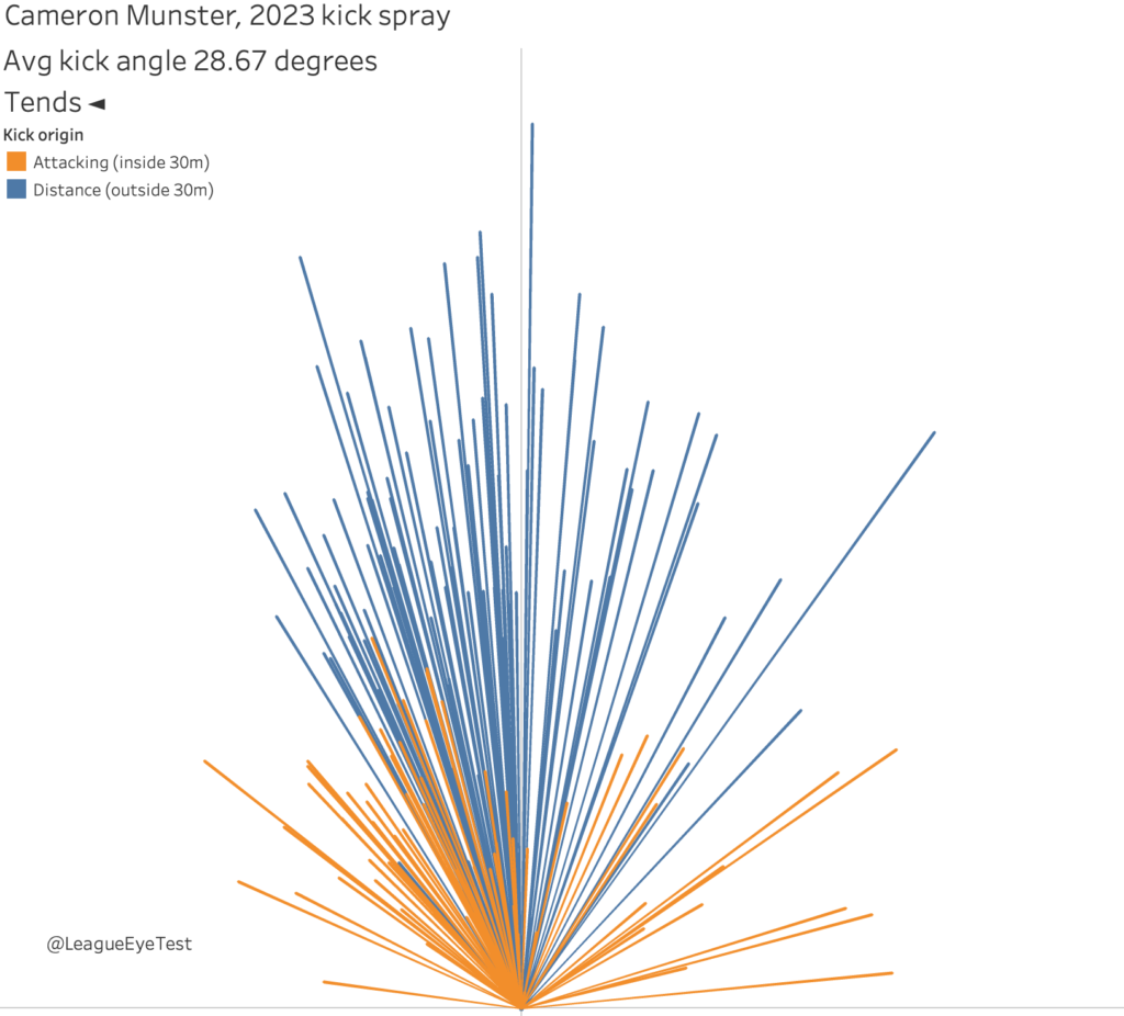
Now we’ll compare the above charts for Cronulla’s halves with the Storm pair, starting with Cameron Munster, tending left.
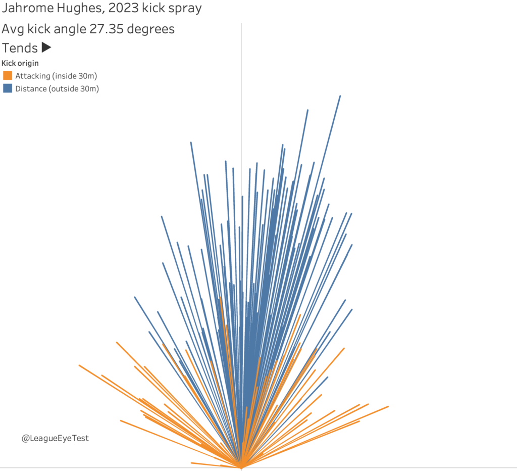
Here’s Jahrome Hughes kick spray chart, tending right overall although his attacking kicks are more evenly distributed than his distance kicks or Munster’s attacking kicks.
You can also see some other quirks, such as with Canterbury’s Matt Burton below.
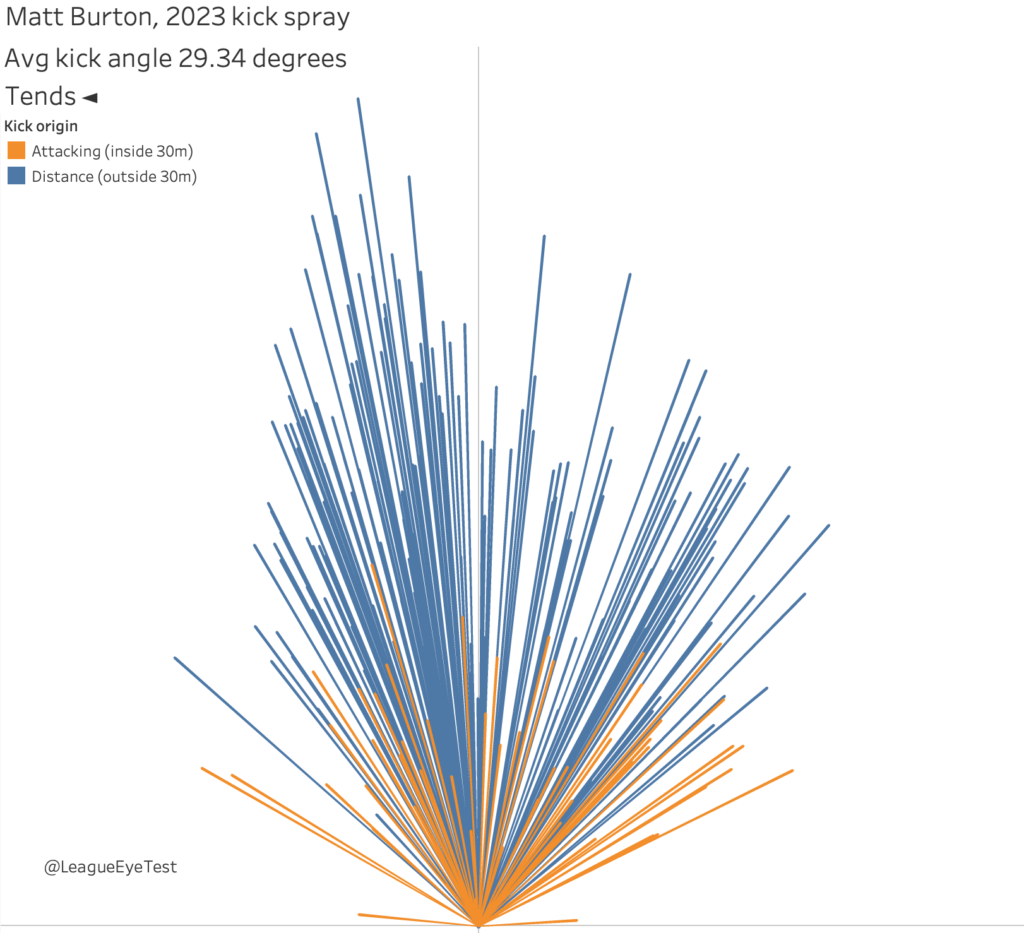
Overall his distance kicks are predominately aimed left side, and usually make it further downfield. His distance kicks aiming to the right don’t end up as far down field because of the extra angle. And his attacking kicks are spread much more evenly between both left and right side than his distance kicks.
The other thing we can do with these charts is compare performances over a season. For example, here is Jackson Hastings kick spray from 2022 with the Wests Tigers, with an average kick angle of 30 degrees.
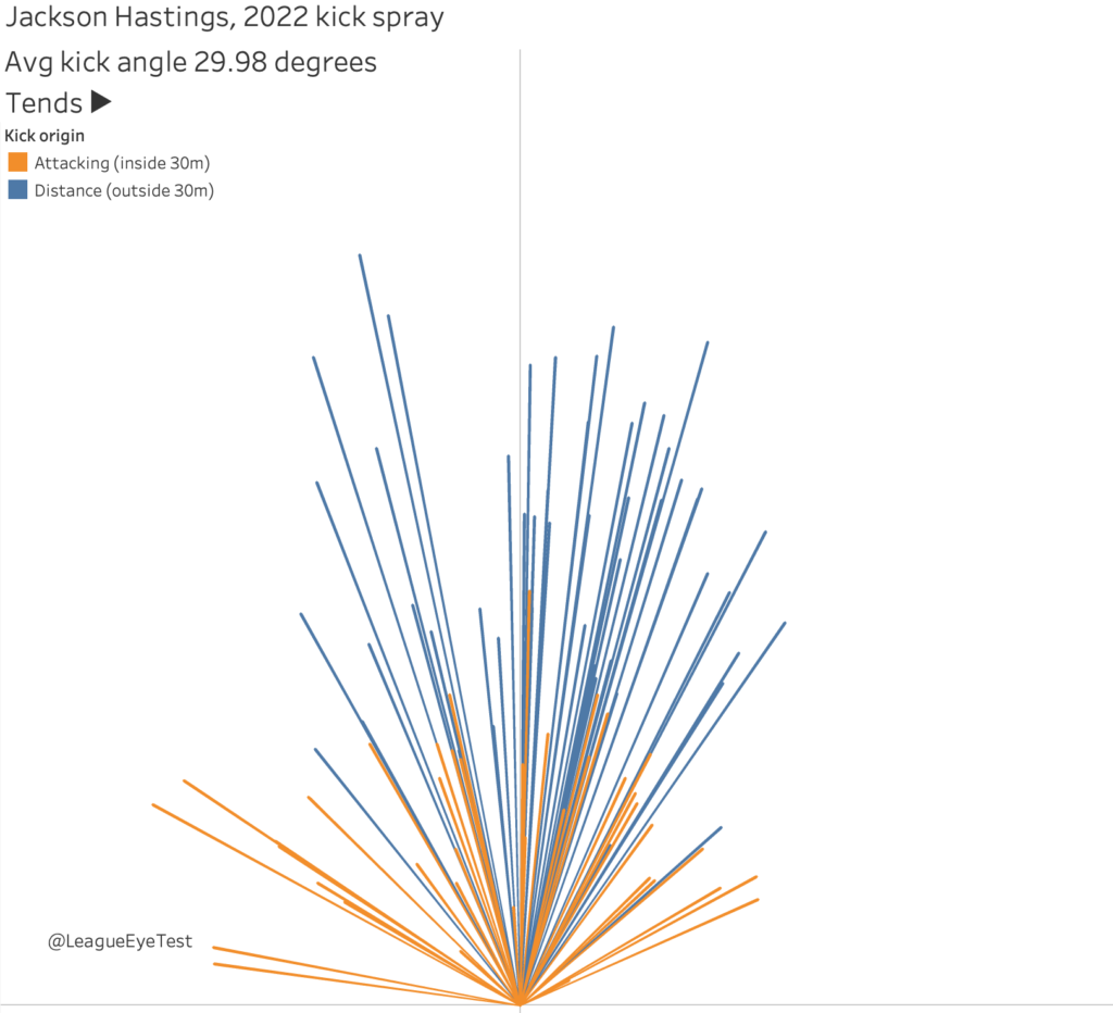
As the Tigers second or third choice kicker behind Luke Brooks and Adam Doueihi in 2022 this spray chart is understandable. Distance kicks are likely to have a smaller angle than attacking kicks, which are usually aimed towards the corners.
And here is his kick spray chart with the Knights in 2023, with an average kick angle eight degrees narrower at 22.07 as Newcastle’s primary general play kicker.
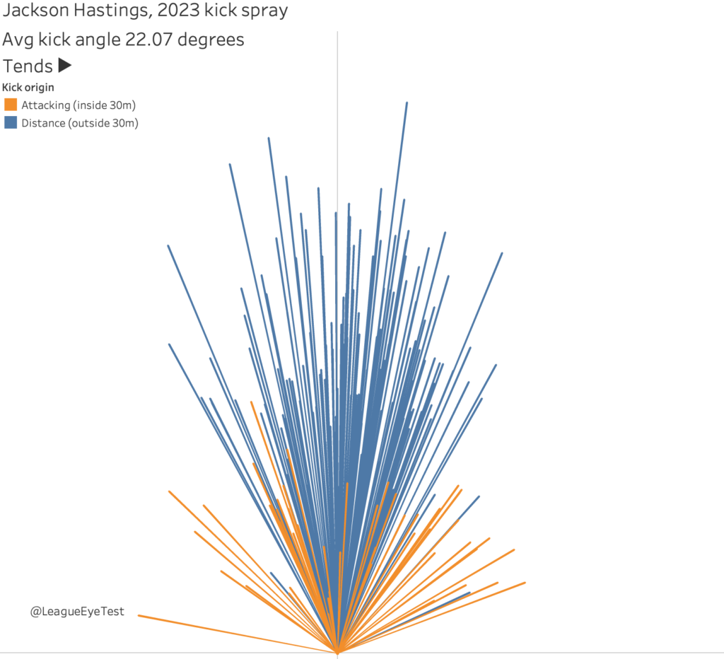
Again we can see the impact of an increase in volume of distance kicks, which generally reduces the average kick angle.
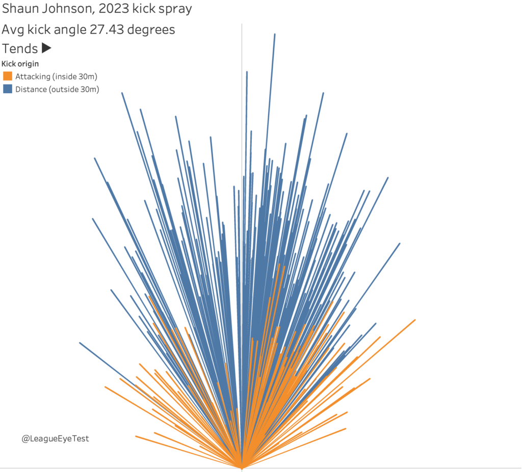
Finally, here’s Shaun Johnson’s chart from 2023 because I still think about how great he was last season on a regular basis.
I am not sure how regularly I’ll be using these charts this season, as on a single game basis they’re going to suffer from small sample sizes and tactical choice. I can envision using them to see where Manly is having Luke Brooks kick the ball, given that Daly Cherry-Evans was so dominant.
Similarly, it will be interesting just how much of a kicking load Jamal Fogarty will have in Canberra with Jack Wighton having left the nations capital for South Sydney.
In the end I’m pleasantly surprised to see how useful these charts are in profiling NRL kickers. There’s nothing ground breaking here, but it’s helpful to have some hard data on kicking tendencies. It’s something that would be uncovered from a lot of video work, and I wouldn’t expect this to ever replace that. But who has time to look through every one of Cherry-Evans 600+ kicks from last season?
As an extra analytical tool, I think it has value in providing a clear big picture view of a players kicking tendencies. There are additional layers of context such as margin and time remaining that will impact the goal of a kick and could be considered.
The next step, as mentioned above, would be to add another layer of information which would be kick outcomes, which would be especially valuable for attacking kicks. I’m not sure when I’ll get around to it, but it’s added to the list of things I’d love to do if I ever had a decent amount of free time.
Maybe next off-season?