
One of the things I’ve noticed over the past few rounds is that the average time of ball in play has dropped slightly to the pre Rugby League 2.0 levels. This comes after a decent increase earlier in the season once the rules were changed. Focusing just on time in possession, the last NRL three rounds haven’t had more than 57 minutes of ball in play, the three lowest rounds this season and both before V’Landysball was introduced in Round 3.
This led me to investigating why, and I put together the below chart plotting time in possession (sourced from NRL.com) against points scored per game. The blue line represents average time in possession for the first 14 rounds of the 2019 and 2020 seasons, and the yellow bars represent the average points scored per game in each round (by both teams). There’s a reference line on these bar charts as well to show the average for 2019 and 2020. For points its about the same – 38.8 in 2019 and 39.9 in 2020.

Initially I thought that the amount of points scored was reducing the time in possession, with more tries and conversion increasing the amount of time the ball was doing nothing. But if you look at the above chart, it’s not really apparent – Rounds 8 and 11 had average game scores below 40 points, but time in possession above 62 minutes, significantly higher than other rounds this season.
I should note at this point I’ve filtered out any golden point games to normalise minutes per game. A great example of why is Round 3 2020, where the average goes from 58.81 to 61.46 if you include the Panthers v Knights drawn match which had a whopping 80 minutes of time in possession. Another note is that Round 12 2019 had only four games played due to State of Origin, which is why it looks like an outlier.
It’s not due to tries either, see below for the chart that shows why. Round 7 2020 had 8.3 tries and nearly 58 minutes of time in possession, while Round 9 this year had 6.7 tries but 62.7 minutes of possession. Again, this makes sense with the previous chart as points are a factor of tries scored.

My next thought was maybe there are fewer penalty goals? There are fewer penalties being called, so it makes sense that there were fewer penalty goal attempts this season. Whether or not that’s a good or bad thing is another discussion, especially in those instances where a team is down 2 inside the opponents 20m zone and gets a set restart. But that’s another matter for another time. Below is penalties awarded plotted against time in possession.

This led me to look at penalty goal attempts against time in possession. The data checks out – 1.6 attempted penalty goals last year against 1.1 in 2020. And they’re being taken at a lower rate too. In 2019 penalty goal attempts comprised nearly 20% of all shots at goal. In 2020, that number has dropped to just 13.6%. So that’s the likely reason for the increase in time in possession, right? Less time standing around waiting for a kick at goal.

Hang on, let’s look at something a bit closer on that chart. Round 1 and 2 had time in possession of 58 and a half minutes and an even 57 minutes, respectively. That’s more time in possession than the last three rounds under one referee and with set restarts. There’s actually been six rounds since Round with less time in possession than Round 1.
Yet Round 1 and 2 had over 2 penalty attempts per game, far higher than the rest of 2020 and more than most rounds last year to the same point. How did those two rounds still have high time of ball in play yet more penalty goal attempts?
Maybe the time elapsed during a penalty goals is counted as time in possession? If that were the case, that wouldn’t explain Round 12 having 56.6 minutes in play with 1.4 penalty goal attempts per game, while Round 8 had almost 63 minutes in play with just 0.6 penalty goal attempts per game.
Maybe the game is just faster? In this “faster pace” era, everything is up, and more stuff is being done. So far this season we’ve seen an increase in time that the ball is in play. There’s an increase in runs and play the balls as well. Although not an increase in play the ball speed.
But we do know from the first chart that the ball is in play more this season by about 8% compared to 2019 for the first 14 rounds. Runs are up nearly 10% compared to the same point in 2019. Passes are up 5%, line breaks are up 7% and tries are up 10% Everything is up! More stuff is good!
Kicks are also up 7.5% year on year, with long kicks up 17% and attacking kicks are up 7%. More stuff! But hang on – weighted kicks are down 20%. That’s strange. Forced dropouts are down 2.1%. Kicks dead are down 3%. Why would those kicks be down year on year if everything else, including other types of kicks, has increased?
The fact there’s not a corresponding increase in weighted kicks, kicks dead and dropouts, and a higher increase in attacking kicks than other statistics indicates something has changed. You might be slowly getting at where I’m leading with this and why its taken over 700 words.
To save you anymore of this shaggy dog story, here’s my crackpot theory – teams have gotten more efficient and accurate at aiming their attacking kicks just outside the goal area to avoid a seven tackle set. The rule change which came into effect in Round 1 that gives airborne attacking players the same level of protection as airborne defensive players is surely a driver for this, as Daniel Tupou was showing before succumbing to injury.
This explains the drop in weighted kicks but the large increase in attacking kicks. Fewer kicks reaching the in-goal area leads to fewer dropouts which can take up to 45 seconds each. By aiming them a bit shorter than the try line, at worst a team will give up possession less than 10 metres out or a scrum at the same point. This is a much better result than a seven-tackle set from the 20-metre line.
Why does this make such a difference in time in possession? A drop out usually takes 40-45 seconds off the clock, because the NRL has a rule saying you can take that long (another rule change with unintended consequences). In the first two rounds this season, there were 20 fewer forced dropouts than the first two rounds last season than in 2019. If you are generous and say each one takes 40 seconds, there’s 920 seconds saved across two games. Divide by 60 to get minutes and then divide again by the eight games per round and you get an extra 57 seconds saved on average per round purely from fewer dropouts.
This would account for some of the time in play change for Rounds 1 and 2 this year compared with last year. It also explains why Round 3 had only a slightly higher time in possession than Rounds 1 and 2 – the time savings from reduced penalties was cancelled out by having over five dropouts per game that round. The chart for average dropouts against time in possession is below.

These first two rounds this season serve as my exhibit A, albeit with a small sample size. There is similar average time in possession to post Round 3 (excluding the golden point draw), but there were still two referees and no set restarts. A comparable number of penalties were awarded as previous seasons yet more penalty goals attempted. The key is fewer dropouts in Rounds 1 and 2 compared to 2019, and below the average for 2020.
Need more proof that a reduction in forced dropouts might be part of the increase in the time of possession? Exhibit B – the last three rounds have had the three lowest time in possession averages this season, all under 57 minutes as noted in the first paragraph. In the last two of those rounds (13 and 14, factoring out Round 12 due to fewer games), dropouts are up 31% year on year and weighted kicks up 11%. As opposed to down 2% and 20% for the season so far. Goal attempts were down 3% over these rounds too, ruling that out as a cause as well. Why the change in kicking? Teams may be finding that their tactic of launching more bombs aimed outside the try line hasn’t been as successful and are adapting. Whatever the cause, there’s another link between time in possession and dropouts taken.
I’m not denying that there is an increase in time in possession due to the Round 3 rule changes, the reduction in penalties also plays a part. There’s an average of three fewer penalties per game this season, and with the NRL has claimed there were five penalties per game in the play the ball last season and each one costs about 22 seconds of play. If you multiple those 3 fewer penalties by 22 seconds, there’s another minute with the ball in play. Add in fewer penalty goals and there’s a bit more time gained. Yet there’s also a similar component of time being saved from fewer line dropouts.
The increase in time on possession hasn’t isn’t just a result of rule changes, but a larger and more complicated combination of change in playing style to suit for these rule changes. The consistent attribution of faster “pace” and more “stuff” being done given solely to set restarts and one referee is proving to be a false equivalence, but one that will get a lot more airtime to boost agendas. If you really wanted to speed up the game, you’d halve the clock on dropouts.
Penalty goal attempts by team
Continuing on from the previous topic, as part of this analysis I had a look at penalty goals compared to overall goal attempts per team this season. Penalty goal attempts are the top half of the shaded area in dark red, with try conversion attempts in the pink shaded section.

I really like this chart for a few reasons. The first is that at a glance you can see if there has been an increase or decrease in goal attempts per season, which in then gives you an indication of an increase in tries scored, as well as how many they’re scoring. And you can also see who has been taking more or fewer penalty goal attempts in the dark red shaded section. Plus, by putting all 16 teams in one chart it’s really easy to compare them.
You can see the decline in the Broncos this season, and they have gone from taking 19 penalty goal attempts to this point in the season in 2016, to just three attempts in 2020. This also coincides with the rise of Souths as a penalty goal taking team with the change to Wayne Bennett in 2018.
The ascent of the Sharks as a points scoring is quite clear after being a very conservative team under Shane Flanagan.
Jason Taumalolo, king of long runs
It’s no surprise that Jason Taumalolo is one of the most damaging runners in the game. I made mention last week that 80.6% of Taumalolo’s runs were 8 metres or more. That’s by far the highest percentage of any forward, with Daniel Saifiti close behind at 80.1% but on fewer runs as the only other forward above 80%.
And that’s where the Taumalolo edge comes in. Averaging nearly 20 runs a game, and with 80% of them that means that almost 16 runs per game are at least eight metres, and less than four are under 7 metres. Here’s a visualisation of how dominant a runner Taumalolo is, with blue dots representing starting players and godl dots for interchange.

The above scatter plot clearly shows just how much Taumalolo is in of a league of his own. The next two points closest to him are James Tedesco and Roger Tuivasa-Sheck, but both sit under 14 runs per game of 8 metres or more. Yet they’re still averaging two fewer runs of at least 8 metres per game than Taumalolo. No wonder the Cowboys make so much ground with the the ball.
Edge black holes
An interesting comment that came up on Twitter recently about Dragons centre Euan Aitken and his upcoming move to the Warriors.
Is that really true about Aiken? Is he a black hole? Let’s look at runs against passes for edge backrowers and centres this season to see if it is the case.
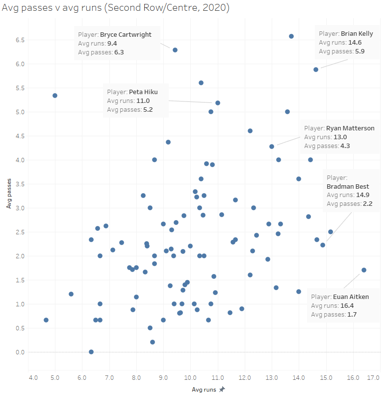
It appears to be so, with Aitken averaging 16 runs per game at centre this season, but less than two passes per game. I feel sorry for whoever is lining up outside him, they’re more likely to catch a cold COVID-19 than the ball.
Knights rookie Bradman Best also looks to have a similar issue to Aitken, with an average of 15 runs per game but just over 2.2 passes per game.
I’ve highlighted a few other interesting players on this chart as well. Bryce Cartwright should be no surprise as he’s a known offload merchant. Peta Hiku and Brian Kelly wouldn’t be in most peoples top centres list but they’re
Finally, Ryan Matterson has been mentioned a few times this season as one of the reasons for Blake Ferguson having a down season by his standards. Yet the numbers here show he’s quite adept at passing the ball, with many of his passes coming as offloads. Maybe they’re just all back inside? Hopefully one of them ends up in the hands of Fergo before the season ends.
Jahrome Hughes and Dylan Edwards having sneaky good seasons
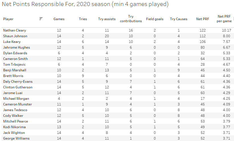
A quick one to end the week, just wanted to point out how Jahrome Hughes is having a sneaky good season. I had pointed it out on twitter last week, as Hughes sat just behind the big three this season – Nathan Cleary, Shaun Johnson, and Luke Keary – in Net Points Responsible For.
If you’re new to the site, Net Points Responsible For (NPRF) is a statistic that highlights playmaker contributions on both sides of the field. It adds tries to try assists, try contributions, and field goals, while taking away points for try causes. Hughes still sits fourth at 6.67 NPRF per game, and less than one point per game behind Keary for third.
Oscar Pannifex at Rugby League Writers has also noticed it over the past week, highlighting his recent. As a side note, if you’re not checking out Oscar and Jason Oliver at Rugby League Writers you’re missing out on the best weekly NRL content online.
Panthers fans will also notice Dylan Edwards sitting in fifth, equal with Cameron Smith. Edwards is another having a fantastic season without a lot of fanfare (except from Panthers fans), Looking at his radar chart, he’s comparable to Kalyn Ponga this season but with about 1% of the hype.

If you enjoyed this post please consider supporting The Rugby League Eye Test through one of the links below.
Scan the QR code or copy the address below into your wallet to send some Bitcoin to support the site Scan the QR code or copy the address below into your wallet to send some Ethereum to support the site Scan the QR code or copy the address below into your wallet to send some Litecoin to support the site Scan the QR code or copy the address below into your wallet to send some Bitcoin cash to support the site Select a wallet to accept donation in ETH BNB BUSD etc.. Donate To Address
 Donate Via Wallets Bitcoin
 Ethereum
 Litecoin
 Bitcoin cash
Support The Rugby League Eye Test
Support The Rugby League Eye Test
Support The Rugby League Eye Test
Support The Rugby League Eye Test
Donate Via Wallets


What about scrums??? Without any data to reference, I feel that this year there have been less kicks into touch, which also chews up time. I can only summise that the ability to set the scrum position is a deterrent to finding field position due to opening up both sides of the scrum for an offensive play? Does anyone have the data to analyse?
bro you can’t be releasing content this late. I’ve already ripped two cones and it’s hard to know what is going on. good reading bro.
Something to consider, when a try is scored and awarded straight away or even when clock stopped for video review, the time taken until the actual goal attempt is made is horrific. I know refs stop the clock but i noticed moses mbye takes at least 90 seconds to 110 seconds off the game clock to take conversions, and thats still with the ref blowing time off. If wests scores 4 tries in a match thats 8 minutes in game time.