
Nothing like a quiet week in rugby league.
Magic round has come and gone, and the game is further slipping into territory that could be best described with the “f” word – farce. The blowouts have continued as well, as shown by the wonderful charts from friends of the site NRLFanalytics and AndrewRLP at the conclusion of Round 10.
It was only four seasons ago that we had almost 40% of games decided by one score. Now it is almost half of that, with just 21% of this seasons 80 games decided by 6 points or fewer.
We know that the changes in rules are contributing to these scores, with the top teams exploiting their advantages in a number of ways. One way is by controlling field position at a rate that hasn’t been seen in years.
With rules designed to encourage fewer stoppages and increase time in play, we’ve seen more of the game played through the middle of the field with teams are running out of their own half more. In the era of penalties instead of set restarts, teams would spend more time in midfield as they’d get a free 20-30 metres of field position.
A few rounds back I showed the below chart, which breaks down the percentage of play the balls into three locations – inside own half, opponents’ midfield, and opponents 20m zone. I find it’s a great way of showing if there’s been any movement in where the game is being played, and over the past few seasons it has moved after a stable period from 2014-2017.
The percentage of play the balls inside a team’s own half has increased from 51% in 2018 (coincidentally the last “crackdown”) to 57% in 2021. Here’s the update after Round 10 and things haven’t changed much since the last update.
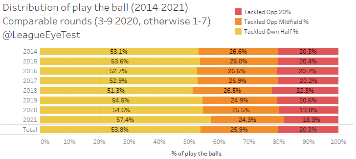
It also shows that most of this own half possession is coming at the expense of time spent in an opponents 20m zone, which dropped under 20% in 2020 and is down to just 18% this season. That’s not necessarily a bad thing, as you don’t need to spend time inside the 20 metre area to score a try, which is one of the great things about our game. But it does point to safer football being played outside attacking areas.
I alluded to it earlier, but part of this is the contenders being able to dictate field position a lot easier with a miniscule punishment for slowing down the ruck or creeping offside. Here’s the breakdown if the above chart by team for 2021.
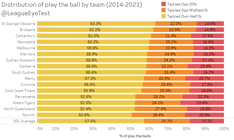
Penrith stands out here with only half of their play the balls coming from inside their own end of the field. Anyone who has been watching them play over the past two seasons knows it is a part of their game, and was something that the Eye Test noticed last season. North Queensland are next at 52% and have historically had a low own half percentage due to Jason Taumalolo picking up 10 metres every time he runs the ball.
At the top of the scale, the Dragons spend over 63% of their play the balls inside their own half, and just 14.6% inside their opponents 20 metre area. The Tigers spend the most time inside an opponent’s 20 metre area, with 23.4% of their play the balls coming from that part of the field but haven’t been able to capitalize as they sit ninth (cue laughter) in points scored.
Unfortunately, that chart doesn’t really convey the point I’m trying to make though, as Melbourne spend the fifth most time inside their own half at nearly 60% yet have the second best points differential in the NRL.
Where you do see it is when you change the perspective to opponents, as shown below.

The top three this season, Penrith, Parramatta, and Melbourne, are all keeping opponents inside their own half on at least 62% of play the balls and restricting them to 15% or fewer play the balls inside 20. Parramatta specifically are holding teams in their own half for nearly two thirds of total play the balls.
To put this in perspective, there has only been one team since 2014 that has held opponents to 60% of play the balls in their own half (we’ll get into that shortly). This season we have three. It’s yet another data point showing that the new rules of rugby league are contributing to some incredibly one sided results.
Souths aren’t too far behind the top three at 59.5%, while the Roosters buck the trend of the “big 5” teams for 2021, at nearly 10% lower than the top three, with just 53% of their opponent play the balls in their own half. This isn’t too surprising, because as discussed a few weeks ago, the Roosters usually have one of the worst completion rates in the NRL and regularly give up field position to opponents, relying on their strength in defense.
Another noteworthy point from this version is that Wests Tigers opponents spend the third most amount of time in their 20 metre area. If you combine that with the amount of time the Tigers spent attacking the try line, it would appear most of their games are played at either end of the field and much less than an average NRL game spent in between. Which probably explains their dysfunctional start to the season.
Staunch supporters of the NRL regime will claim that “there have always been teams blowing out other teams” I hear you say. And you’re right. But none of them are doing so with the vice like grip on field position that the Storm, Eels and Panthers are this season.
The chart below shows average margin of teams by opponent and season, plotted against the amount of time spent in their own half by percentage of play the balls from 2014 to 2021. Data points are coloured by season, with yellow representing 2021.
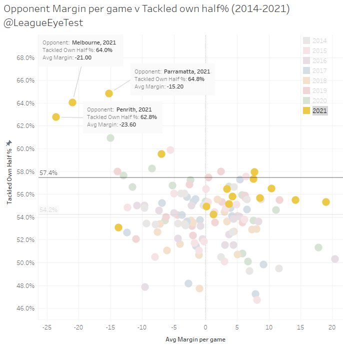
Here it’s even more obvious just how much of their performance this season are outliers and that the new rules are playing into this. As I alluded to earlier, only one other team has held opponents to more than 60% of play the balls in their own half since 2014, which was Penrith in 2020 (the green dot just below the Panthers 2021 data point).
The NRL average from 2014-2021 is 54% of play the balls in your own half, and every team this season other than the Roosters (who we identified above at 53%) are above this long term average. This chart also shows just how the 2021 average of 57.4% is skewed by the top three teams. Additionally, no other teams have been averaging more than 15-point margins of victory during this period either.
This trend towards controlling field position is even more apparent when you break these numbers down to halves, showing the Eels have a stunning command of field position in second halves.
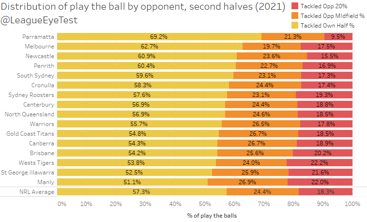
Teams facing Parramatta spend almost 70% of their time in their own half, with less than 10% inside the Eels 20 metre zone.
The blowouts will continue as long as the rules benefit those who flaunt them the most, expanding the gap between the very good and the very ordinary.
Let’s try that crackdown again
Looks like I was a bit premature in suggesting the crackdown wasn’t a crackdown last week, with 23 charges and a slew of penalties last weekend. The full rap sheet is below:
There were 86 penalties in Round 10, 10.8 per game, up from 60 in Round 9, and the most since Round 5 2020 when teams worked out how to game set restarts. That’s still a far cry away from the 16 per game we saw in the height of the penalty crackdown of 2018, but still a significant increase. If the NRL wanted to deliver a message about high shots, they certainly achieved that.
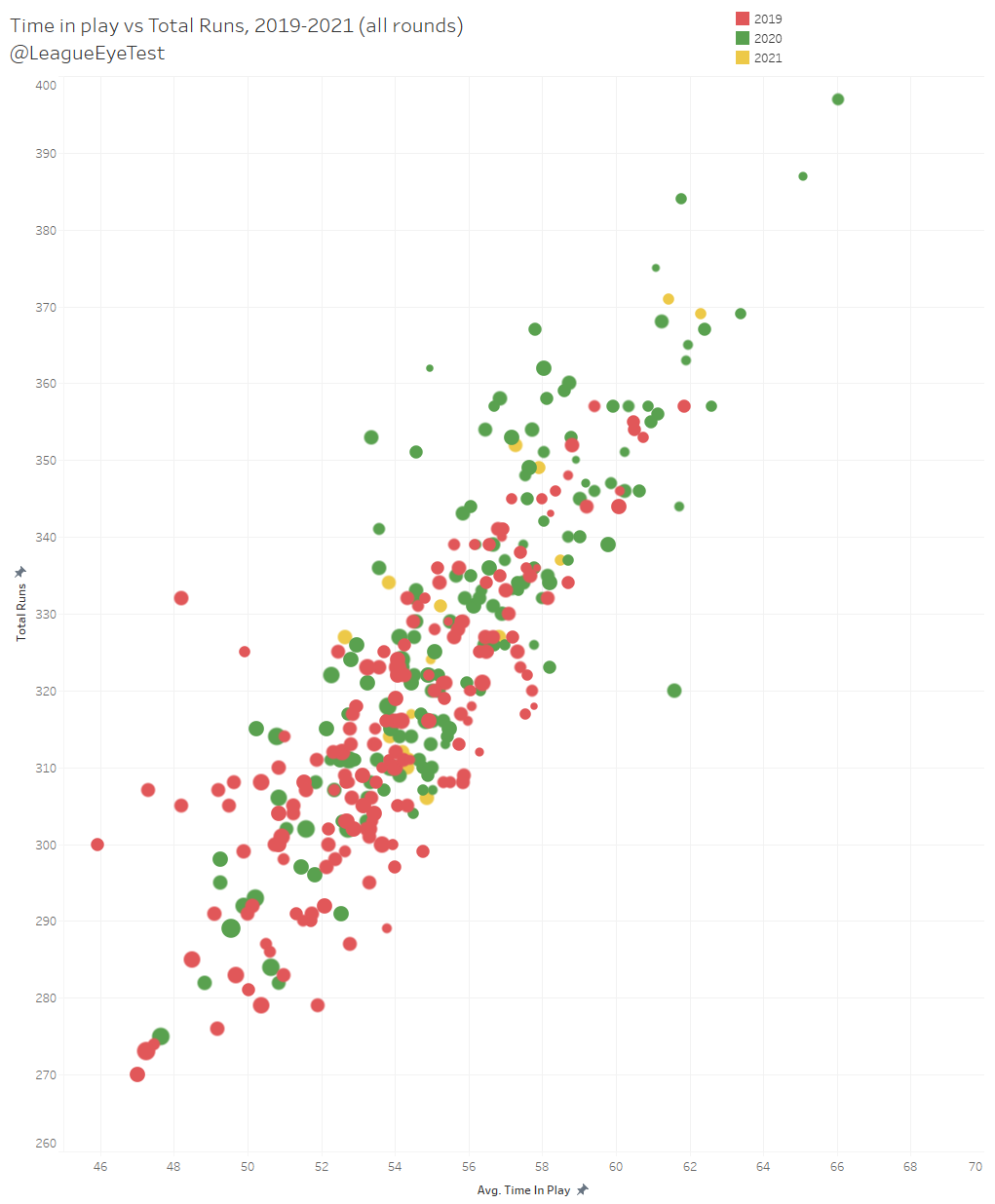
Unsurprisingly, when you combine that increase with the number of tries scored, Round 10 saw the lowest time in play since Round 13, 2019, coming in at 52.97 minutes. That’s the first time since the introduction of set restarts that time in play has dropped under 53 minutes.
Below you can see the relationship between tries scored and time in play. Generally the trend is that the more points scored, the lower time in play.

The other thing of note with this crackdown is that there was very little change in set restarts being called. In Round 10 there was slight increase in first halves (3.9 to 5.0), and an identical number in second halves (3.1). Below is the half breakdowns of set restarts and penalties awarded where you can see just how little changed with set restarts.

The big difference came in penalties awarded, jumping from 3.88 to 5.0 in the first half and nearly two whole penalties more blown in second halves, up from 3.63 to 5.75.
Part of that was due to two games – Tigers v Knight and Penrith v Titans – having a total of 17 penalties awarded in each game. Here’s the Round 10 split by timeslot.

Only one other match was in double digits, which was Friday evenings Brisbane v Manly game, and every other match had fewer than 10 penalties awarded. If you remove those 17 penalty outliers, the round average would be 8.6 and much closer to the season average.
It will be interesting to see how long this crackdown lasts, as mentioned above the 2018 didn’t last past the midpoint of the season. This one affects player welfare which is why I hope it does continue, even if it was atrociously implemented with little foresight just like the rest of the rules under our esteemed emperor.
I probably can’t sum it up much better than the tweet from my personal account on Friday evening at the conclusion of the Broncos/Sea Eagles game.
The main issue is that the root cause of these high shots isn’t being adressed by this crackdown. Someone in power will need to admit they were wrong by removing stoppages which have led to this situation. If player welfare is the main issue, then the logical conclusion would be to stop forcing them to compete under extreme fatigue which is exacerbating these issues.
What the Eye Test and Melbourne have in common
Overshadowed by the goings on in the Brisbane v Manly game was an article by Roy Masters on the Sydney Morning Herald site on Friday evening. The headline was a bit misleading, but there was some excellent insight in the article regarding the pace of the game.
Most of it will be common ground for regular Eye Test readers, but my favourite saying about analytics and data is that it is the “art of being less wrong”. The article is still worth a read, however, as it brings up some new data points and insights.
One of the new nuggets of information that I did find extremely interesting is that the Storm look at “work rate markers”:
“For example, the Storm calculate what they term “work rate markers”, counting a player’s total runs, tackles, support, and kick pressure, divided by the number of minutes the player is on the field.
Whenever former champion fullback Billy Slater recorded a score of 0.22, he walked off the field totally spent, while this year’s custodians, Ryan Papenhuyzen and Nicho Hynes, have averaged figures 30 percent higher than Slater.”
Demise of the robots: Why ad-lib football is king again, https://www.smh.com.au/sport/nrl/demise-of-the-robots-why-ad-lib-football-is-king-again-20210514-p57ry0.html
Regular Eye Test readers may know that the site was founded on needing somewhere to provide some context for the advanced stats I use – Tackle %, Run % and Involvement Rate. These were liberally cribbed from NBA advanced stats and I tried to apply similar thinking to rugby league. The aim was develop something that would show workrate but not favour those who played more minutes and filled up more statistical buckets, as the VB Hard Work index does.
I’d started calculating them sometime in late 2018 as a way to identify middle forwards work rate, which highlighted how big a motor Eye Test first ballot Hall of Famer Daniel Alvaro has. Below is the first time I could find that I posted them publicly, well before I had even thought about the Eye Test.
The largest difference between my advanced statistics and what the Storm are using is that I also adjust for possession, rather than just doing a pure per minute rate. If two players made 50 tackles in 80 minutes, but Player A faced 150 play the balls and Player B faced 100 play the balls, the second player is making the same amount of tackles at a higher rate. It’s a minor change that doesn’t penalise players who face a lower number of play the balls, since you can’t complete a tackle if your opponent doesn’t have the ball.
Back to the article, seeing that Melbourne is using something similar prompted me to check how some of my advanced stats compared to the Storm example in the above article. Was there a corresponding increase for Papenhuyzen and Hynes? I’ve used Run % as fullbacks don’t make a large number of tackles and I don’t have access to data for decoys or kick pressure, but the results for every Melbourne fullback that has played at least two games since 2014 are below.
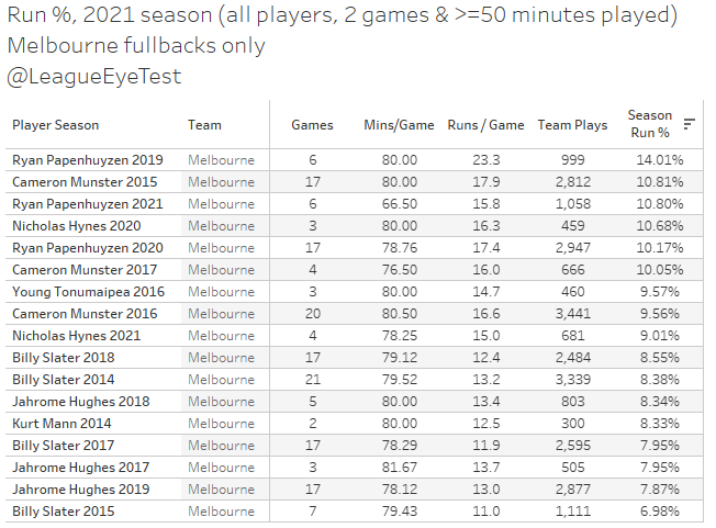
Slater owns four of the bottom eight results for the 17 fullbacks Melbourne have used since 2014 who have played at least two games. In seasons where Slater played more than seven games, his Run % was in the 8% range. You can see that Papenhuyzen, Hynes (in 2020) and Munster, all have a Run % higher than 10%, with Papenhuyzen at 10.62% for 2021, which is slightly under 30% higher than Slater’s peak. Even for 2021 Hynes is still ahead of Slater’s best season during this period. That does show that Melbourne fullbacks are getting invovled more in recent years than during Slater’s era.
Apologies for the navel gazing, but I felt it’s worth pointing out that someone with very limited time due to full time work and family commitments independently came up with a similar internal metric to used at an NRL club, using only publicly available data. Imagine what the wider NRL community could come up with and advanced the acceptance of data within the game if more information was easily accessible?
If you enjoyed this post please consider supporting The Rugby League Eye Test through one of the links below.
Scan the QR code or copy the address below into your wallet to send some Bitcoin to support the site Scan the QR code or copy the address below into your wallet to send some Ethereum to support the site Scan the QR code or copy the address below into your wallet to send some Litecoin to support the site Scan the QR code or copy the address below into your wallet to send some Bitcoin cash to support the site Select a wallet to accept donation in ETH BNB BUSD etc.. Donate To Address
 Donate Via Wallets Bitcoin
 Ethereum
 Litecoin
 Bitcoin cash
Support The Rugby League Eye Test
Support The Rugby League Eye Test
Support The Rugby League Eye Test
Support The Rugby League Eye Test
Donate Via Wallets


1 Response
[…] of the site Rugby League Eye Test just answered this among the Round 10 stats and trends article for the week. I’m sure he won’t mind me sharing this image below. Still, click […]